This is my contribution...


Philip Eight, the brand, has become synonymous with magnificent fashion and the most elegant of fragrances. Beloved of the great and the good.
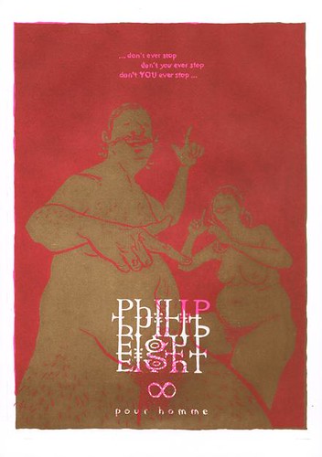
We see here an advert for a new man smell designed for the fat glossies. Although originally conceived as an initial yellow layer plastered over with a second black layer, inspiration kicked in and I decided to try out the florescent pink, caking it in a second coat of raw umber. The pink was magnificent and when shining through the raw umber the colours joined in a deep regal red. I have 18 of these, signed and numbered.
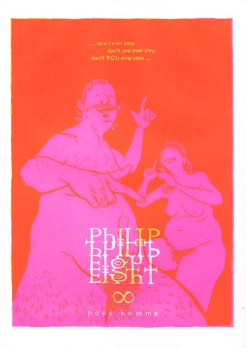
We'd set aside a full night for each of the co:lab designs so I decided to plough on and try a variant on the initial yellow idea... unwittingly treading on the same error Jono and I had made with the screw picture from co:lab 1b. Yellow, it appears, is a remarkably difficult colour to work with when overlapping colours. It seems to lack punch and struggles to hold definition. We printed 21 sheets with a base colour yellow and proceeded to work through 4 alternatives (many of which delivered oddly hazy results) before getting excited about the blend of the yellow with the florescent pink which we had stumbled upon earlier in the process while fooling around. I have 11 of this final combination, signed and numbered.
Addendum: Having seen the workings for these prints Philip Eight has ask Andrew to become his official biographer and over the coming months his life will be documented in pictures at philipeight.blogspot.com.

No comments:
Post a Comment