23.11.10

The Mathematicians

Edouard & Sophie

Here's a peek at the latest prints currently being exhibited at the Bonhoga gallery as part of their Sprickle an’ Peester Christmas show. Co:lab were delighted to be asked to contribute and set about producing two pieces of work each to our own loose theme of "two".
I decided to explore the lives of two French mathematicians and tell their stories in two colours.
As is my want these days I tried a few variations with the colours and particularly like the results from using the same semi-transparent blue for both layer.
The show runs until 23rd December 2010.

Sophie & Edouard two blues

4.11.10

Tanngnjostur og Tanngrisnir

tanngnjostur og tanngrisnir

My Co:Lab cohorts and I were recently asked if we'd like to submit work for this year's Christmas exhibition at the North Rock Gallery. We were, of course, more than happy to take on the challenge and we each set about interpreting their Yule time theme.
Although briefly tempted to tackle the story of the Yule Cat, it was the Julbocken or Yule Goat that, in my research, excited me most. Generally represented in straw bound in red ribbon, the Yule Goat is a strikingly simple and beautiful sight and would lend itself well to screenprinting.
However, as I explored the history, I was increasingly intrigued by it's links with the legend of the Norse God Thor who rode through the skies in a chariot drawn by two goat, Tanngrisnir and Tanngnjóstr (teeth-barer and teeth grinder). At the end of each night Thor would slaughter and feast on his goats only to resurrect them with his mystical hammer the next day and set out anew. I was struck by and sympathised with the curious daily routine these goats would endure and the loyalty they seemingly showed their master.
In my illustration I was most keen to capture that sense of burden these goats carry and contrast it with the spritely enthusiasm of them as newly born kids. I've taken a few liberties in my interpretation of this but it seems fairer on the goats to allow the scene to be reimagined in new ways.
The text in the composition, with the help of google, translates from the Icelandic as "born again with each new dawn"

11.9.10

Bonhoga Open Exhibition: Portrait

Bonhoga Open Exhibition: Portrait
Themed for the first time, the Bonhoga Gallery Open Exhibition this year filled their halls with portraiture. Photography, painting, sculpture, jewellery and print all featured and there was an impressive turn out for tonight's opening (though, disappointingly, many of the prize winners were conspicuous by their absence).
Here's my entry. It is composed from three different five colour screenprints torn and pasted together.

23.8.10

Exeter Poetry Festival 2010

Exeter Poetry Festival promotional brochure

A wee peep at the brochure, programme and a promotional postcard for the Exeter Poetry Festival.
Check out their web page www.exeterpoetryfestival.com for more information.

Online programme view

Exeter Poetry Festival promotional postcard

17.5.10

Telephone, telephone so much

Another co:lab project for you all. This one was produced during the two week residency of the pop-up shop down at the Toll Clock shopping centre. The theme this time around was red and blue with the criteria being that we use red and blue only and the artwork fits to A6. Here is my effort. I can explain the thinking behind it if anyone cares to ask!

Telephone, telephone so much

Co:lab down the pop-up shop

Co:lab pop-up shop – Don't you ever stop...

The co:lab kids would like to thank everyone who came down the pop-up shop, hung out, chatted and bought prints. We've had a lot of fun seeing you all over the last two weeks. Big thanks also to Karen Bruce without whom the shop never would've happened and all the folk involved with Vunk Fest. Looking forward to the big weekend in July!

Two Ply Gin

Co:lab have once again been at the printing ink. Our latest project is 3-fold and explores the rich seam of interpretation inherent in our alphabet. 26 individual characters being reproduced in countless variations the world over.
In presenting our take on our favourite graphemes we not only show the alphabet in its natural order but also put them to practical use in the context of 3 very different pangrams. Additionally each co:labber has chosen their favourite letter to BIG up.

two ply gin alphabet

I experimented extensively before reaching a style I was happy with and felt would carry through from A to Z with relative ease. The technique involved great reams of toilet paper, lots of water, ink and a big fat brush. In selecting a pangram I decided to search outwith my native tongue and found two potent and very different samples. One Danish and one Portuguese. I went with the Portuguese pangram "Um pequeno jabuti xereta viu dez cegonhas felizes" which as it turned out didn't feature all 26 letters as the Portugese alphabet isn't exactly as it is in the UK. This left me missing w,y and k – a problem I navigated with the naming of my jabuti "Wakiya".

two ply gin pangram two ply gin U

Curiously, despite the Portuguese pangram, the three pieces look particularly eastern. Largely I guess thanks to the method I used to create the letters but also how well they work reading top to bottom as opposed to our convention of left to right.

There were only twelve of each of these printed and we launched them two weeks ago with the opening of the temporary Vunk Fest pop-up shop. Sales of this and other prints were encouraging and I'm pleased to say that my pangram is now completely sold out. Thanks to everyone who bought a copy of this and/or any of my other print. It's much appreciated and I hope you enjoy having them in your home!

1.3.10

Turtle print

Turtles Red, Yellow and Blue

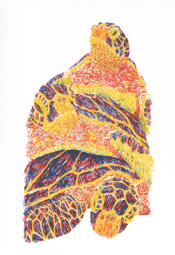
Some months after finishing the inking work, the turtle print has finally reached completion. It was a delay that amazed with the problems encountered in finding somewhere to produce the A3 acetates to be used in exposing the screen. Fortunately my good friend Martin down in Falkirk came to the rescue with a suitable solution.

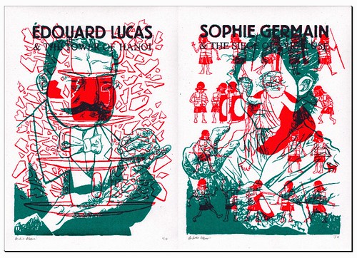
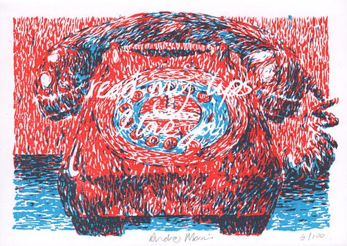
So once again, with Jono's generous assistance, I set about printing. Two variations this time. The first, in keeping with my original plan, featured the three basic primary colours of red, blue and yellow. The idea being that through overlapping I'd hopefully achieve the secondary colours of orange, purple and green. What I actually got wasn't quite as well defined as this but the results are none the less satisfying with clearly defined secondary colours... albeit not a direct match for those in my mind at the point of conception. And in the interests of the experiment I could have been a bit more liberal with the blending of the blue and the yellow in the pursuit of green. There are 24 of these, signed and numbered.

Turtles Purple, Turquoise and Copper

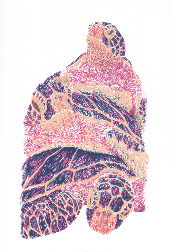
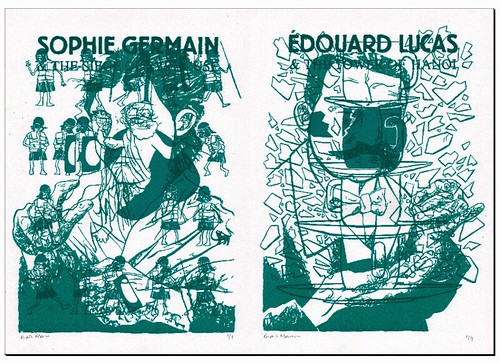
The second variation features purple, turquoise and copper and was purely an additional indulgence taken before washing out the stencils. A chance to play with the composition using a rather more earthy palette. The purple and the turquoise work beautifully and found compliment with the copper (having failed to agree with a pull of raw umber). As I'd hoped, I've learned a good few lessons with this design and can see how I can develop the work further. There are 21 of these, signed and numbered.

All in we spent about nine hours straight working on these prints... coating, exposing, washing, printing, washing, drying, coating, exposing and so on. It was a long cold exhausting day but very satisfying.

15.2.10

Philip Eight

It was a heavy few nights of printing last week as co:lab set about the second of our team tasks. The brief we set ourselves this time was to create, within the space of a week (give or take allowances for general real life shenanigans), an A4 advert suitable for two colour printing. Those were our only spec. The product, concept, ideal or whatever we set out to promote was entirely ours to choose.
This is my contribution...
Philip Eight raw umber/fluorescent pink Philip Eight yellow/fluorescent pink
Philip Eight, the brand, has become synonymous with magnificent fashion and the most elegant of fragrances. Beloved of the great and the good.
We see here an advert for a new man smell designed for the fat glossies. Although originally conceived as an initial yellow layer plastered over with a second black layer, inspiration kicked in and I decided to try out the florescent pink, caking it in a second coat of raw umber. The pink was magnificent and when shining through the raw umber the colours joined in a deep regal red. I have 18 of these, signed and numbered.
We'd set aside a full night for each of the co:lab designs so I decided to plough on and try a variant on the initial yellow idea... unwittingly treading on the same error Jono and I had made with the screw picture from co:lab 1b. Yellow, it appears, is a remarkably difficult colour to work with when overlapping colours. It seems to lack punch and struggles to hold definition. We printed 21 sheets with a base colour yellow and proceeded to work through 4 alternatives (many of which delivered oddly hazy results) before getting excited about the blend of the yellow with the florescent pink which we had stumbled upon earlier in the process while fooling around. I have 11 of this final combination, signed and numbered.

Addendum: Having seen the workings for these prints Philip Eight has ask Andrew to become his official biographer and over the coming months his life will be documented in pictures at philipeight.blogspot.com.

11.1.10

Works in progress

Here's a wee sample of what's being worked on at the moment.
Turtle and Boxerfish layers
The three layers on the left make up the turtles print. This is being produced as a test, experimenting with a dense brush technique and multiple colour overlays. If the results are promising the approach should lead on to other experimentation which in turn should lend itself to larger works I have in mind.
The layers on the right make up the boxerfish print. This is more a piece produced for fun although certain challenges in the colour management and how information is to be related adds to the value of the experience.