17.5.10
Telephone, telephone so much
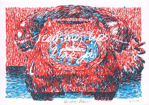
Another co:lab project for you all. This one was produced during the two week residency of the pop-up shop down at the Toll Clock shopping centre. The theme this time around was red and blue with the criteria being that we use red and blue only and the artwork fits to A6. Here is my effort. I can explain the thinking behind it if anyone cares to ask!
Subscribe to:
Post Comments (Atom)
2 comments:
I care to ask? I love it for my own reasons which are my relationship with the colour red and a love I have for that design of telephone.
Hi Jo, I just realised I failed to respond to your comment. Apologies. So yes, seeing as you've asked...
The idea is that, for folk who lip read, there are some shapes that are easily mistaken for others. For example, the word "telephone" can be misread as "I love you". But I also like the oddness of how this piece works on face value. It's the sound of someone desperately trying to stress a point while in actuality saying something quite ridiculous in the context of a phone conversation.
Post a Comment